brochure graphic design elements

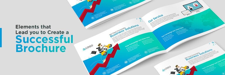
Key elements of brochure design

A List of Incredible Tips to Create Best Brochure Designs

What is an effective form of marketing a business in this digital marketing era? Brochures, of course! So, it becomes essential to get them right all the time. It may sound simple.

But in reality, creating dazzling brochures is not that easy. So, seeking the help of a professional brochure designer is advisable. But before starting, it is necessary to understand some basic concepts. It will help you create more impactful marketing material.

Do you know what makes brochures successful other than their design and content?

In this article, we list those elements that make a brochure stand out and impress your customers. When you are aware of these things, it will help you succeed with your next marketing campaign.

  • Know What You Want.

    It is the first tip for anyone seriously indulged in the job. Brochure designers in Bangalore start by inquiring with the clients about their needs. Some may knock on your door just because they were not successful with their previous efforts. In such cases, inspect carefully to determine what they are trying to obtain.

  • Pay Attention to the Functionality.

    Every design or content element used must add to the functionality of the brochure. If your material can conceal a simple part and reveal it later in ways least expected by the audience, it can impact the readers. Thus, it will stay with the readers more than usual, which ultimately is what you need the brochure to do.

  • Simplicity Works Better.

    Brochures with complex layouts and ambiguous words may not work well. If the users find the brochures senseless, they move away from reading them. The major attraction of these handouts is that they are simple to design and distribute. So, making them complex will yield no benefit regardless of what efforts you put into it.

    Apart from the design aspect, another factor that needs to be simple is the text. It is not always a good idea to load your creative design with grandiloquent words. Yes, it will sound sophisticated, but it won’t bring you any positive response. To get your message to reach the readers, you need to use simple words as well. As they say, beauty lies in simplicity.

    In simple words, keep your layout design and text simple to the maximum possible extent.

  • Limit the Number of Fonts, but Not the Experiment.

    When it comes to creative brochure layout, the fonts you use must compliment the looks. Also, they should be perceivable and keep the readers engaged. It never means that you can use more fonts in a single design. Lesser fonts are always ideal. In general, three different fonts are used- body copy, heading, and sub-heading fonts.

    But there are no limitations to experiment with types of fonts you can use. You can take the paths you find fitting your requirements. Hence, you may use diverse fonts as possible. The only thing you need to take care of is that people find them intelligible while reading.

    So, limit the use of different fonts in the same design. But do not stop experimenting to find diverse ones for your handout.

  • Content is Important.

    Many think that perfect design, attractive colors, and shapes can win the audience. They always overlook the importance of wordings in the marketing material. People read about your products or services despite looking at graphic elements. So, if your messages are not impressive enough, they will turn off the readers.

    Thus, it is vital to get the messages written by a professional copywriter. The reason many companies that offer graphic designing services have in-house writing experts.

  • Hook Them with a Headline.

    One should be able to strike an instant chord with the reader right from the beginning. It is essential to give a catchy headline for the brochure. But put something that will make the reader understand what the content is all about at a single glance. It is, however, not a good idea to give away an entire company’s profile via headline. A headline is a headline – leave other details with the rest of the brochure content.

  • Pay Attention to The Paper Material and Size that You Choose.

    The quality and type of material for your brochure design are of utmost significance. You may choose to use any material as brochures are a one-shot effort. But it is significant to use the best as the print may not come as you expect on materials of subpar quality. Even when you outsource brochure design services, make sure to choose the best material.

    The quality of the paper that you use reflects your professionalism. So before starting with the design process, ask the client about the size and choice of their paper.

  • Shapes, Edges, Sizes

    Who said that you always have to adhere to the rectangular shape of the brochures? No graphic design service provider will ever say so. There are no hard and fast rules when it comes to choosing brochure shapes.

    Many businesses prefer rectangular shapes. But if you are a toy company targeting kids, making your brochures in funny animal or toy shapes can get their attention. It is a scenario; you can experiment with a lot of sensible things based on your targets.

    Besides, the shapes many brochures have the same sharp edges as a standard rule. But you can use rounded edges, which will make the brochure look all the warmer. Let it be tri-fold design, two-fold, or anything round edges can work well.

    Another criterion to consider for designing a brochure is deciding its size. The goal of the leaflet is to make people read about your products or services. So, if you make them dauntingly big, people might even refuse to look at your marketing material. As a golden rule to remember, design your handout to be compact, precise, and to the point.

  • Diversity is the Key.

    People like diversity and change. One needs to remember this fact while designing, creating content for the brochure. To follow a unique corporate style is good. But in reality, diverse aesthetics and design elements are what will get the work done for you. It is what a typical brochure designing company in India always suggests.

    Another aspect that needs to be diverse enough to grab the attention of the readers is the texture. Use textures to bring a unique look and feel to your brochure to catch the notice.

  • It is Always About the Colors and Optimal Use of Images.

    For many, handouts mean diverse colors. It is the intelligent use of colors that attract eyes and attention to your brochure. Dull colors fail to lure the eyes, and you have to do all the rework to fix them.

    Depending on the color palette that you choose, select the images that blend well with the theme. Images communicate better than words and thus, your king-size marketing job gets done. But it never means that you can bombard the layout with pictures. It is a thing that professional brochure designing companies never do.

  • Never Stay Away from Graphics.

    Graphics promote your products or services regardless of the business verticals you operate. The wise use of graphics is significant to make people interested in your brochure. So, the best companies offering brochure design services always emphasize graphics. It is the prime reason for their thumping success.

  • Stand Out from the Crowd.

    Being artistic is an essential tip for a great brochure design. It is crucial to think out of the box in this competitive era. Staying creative alone won’t help when the market is brimming with several talents. What is important is how you can present your idea in a different and inspiring way. Creativeness helps in branding as well as in unique promotions that can leave lasting impressions.

  • The Reader is the King

    It may sound cliche. But the idea is, as a designer, you have to produce what appeals to the readers. Even though you do not like it, you need to choose a standard creative pattern to impress the target audience. If they are pleased with what they see, your product/service will get a good promotion.

  • Think from the Shoes of Prospects

    Make it a habit to remember the end purpose. What was the intended response from the brochure designed? Is it meant to serve as a giveaway at any of the exhibitions in your city? Do you want to put it as leave-behind marketing material? What has to be the chronological order of message presentation when someone opens the brochure? Design for the prospects and not for yourself.

  • Motive the Readers

    Creating content and impressive images will go in vain if there is no call to action. If you want the marketing to work, you have to inspire readers and prod them smartly to buy from you. The call-to-action space in the brochure works well to get this process done.

  • Cover to Make it Exciting

    If you want your audiences to say ‘Wow!’ you need to make the brochure look personal, exciting, and appealing. Covering the same as a case is perhaps the best way to do it. It will bring a personal touch and feel to the brochure, which will make it all the more impressive to the readers.

People want a visual treat and the exact message within the shortest of words and images. They do not expect an extravaganza with a lot of illogical colors and jargon.

Designing a brochure is never a thing of rocket science. But doing it in the right way can bring all the goods you expect from any marketing effort. When you pay attention to these tips, it helps you create a brochure that your audience cannot ignore.

Well! If you are still paranoid about how to go about it, reach us for any help. We are one of the leading graphic design companies based in India. Let’s speak.