The magazine design task may appear to be very exciting, but at the same time, it will test your endurance. Once you get into the groove, things would start falling into place on its own and your task would seem easy to execute. Initially, the difficulty quotient is higher.
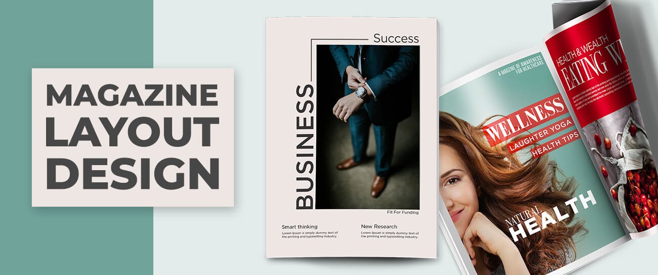
The magazine layout design should be created such that readers feel engaged and impressed at the very first glance. The page layouts should allow for seamless movement of eyeballs and easy tracking of essential information intuitively. The success of the layout designer lies in motivating readers to go through published articles along with the complete presentation including advertisements.
Over the years, design elements have evolved significantly. There are some elements which when implemented consciously can prove to be helpful in capturing the attention of the readers. You will come across such proven elements in this post.
Begin by looking for inspirations to nurture your creative spirit. The success of magazine design is not dependent on the amount that you have spent on it. You need to make the design eclectic and visually- For inspiration, you may look through old magazines to understand the design subtleties or you can go through the creative publications that are put up for display in local bookstores.
What does it take to create a great magazine cover design?
The cover of a magazine is something that catches the attention of the readers first. Key cover design parameters to consider are:
- Word Mark- Name of the magazine and the way of its creation
- Tagline- Complements the title for making the company’s marketing idea clearer
- Space- For providing the publication date in terms of year and month
- Coverlines- Short descriptions hinting at the articles or features you would find inside
Bold coverlines appearing prominently describe topics that have been given more importance. Others follow the main topics in terms of importance.
Magazine Cover Types
A number of approaches are being adopted for designing the cover page of a magazine. Prominent among them are discussed below:
- Image-Based: This design theme is popularly used for magazine covers. In this case, the image of one or more persons is showcased on the cover with his/her eyes set at camera and hissmile creating a positive impact. This approach is common in celebrity, fashion, and men’s magazines. The celebrity on cover page is the driving force for triggering better sales of the magazine. Popular celebrities are featured on cover pages frequently.
- Illustration Based: Digital illustrations are capable of portraying any idea in funny or extraordinary manner. Most mainstream magazines often prefer to steer clear of illustrations on the cover pages with the help of any reputed ilustration companies. Mostly indies and independent magazine publishers prefer illustrations as they don’t look at newsstand sales to calculate success. CGI (Computer Generated Images) are gradually gaining popularity as cover page features.
- Type Based: Appearing more frequently than illustrations but still rarely used, type-based cover pages trigger a sense of shock. Words are presented through type in a powerful look that provokes thought. If words are presented in a beautiful typeset, they can convey the message strongly than images.
- Concept Based: When you want to send across a strong message in a striking or funny way, you can blend all the three approaches discussed earlier. The designer’s responsibility is to remove complexity from the concept so that audiences can understand the theme without having to rack their brains. You need to think from the audiences’ perspective for getting best results.
Key Elements in Creative Magazine Layout Design
A magazine is divided into various sections and sub-sections. This eases the search of readers for particular information. That in turn boosts the interest of the readers and motivates them to spend more time for exploring other topics in the magazine.
Some of the important elements are:
-
Headline
The headline should have strategic importance. The words chosen should be able to stimulate the reader’s interest and make them search for more. Readers who don’t have the patience or the time to go through a magazine should also feel startled after going through the distinctive headline. The headline should be unique. As a magazine editor, you can hire a professional copywriter to get the best headlines crafted.
-
Sub-Heads
Sub-heads allow the article to be organized into various sections or segments. By glancing through the sub-head, one can make a tentative idea about the content of the paragraphs. Font used in the sub-heads is the same as the font of the textual body with small differences. Bold makes the sub-head stand out. The sub-head should not be placed immediately after an image or quote.
-
Drop Caps
Another important aspect of magazine layout design is the drop cap. This is the practice of capping the initial letter . It serves to decorate the text and also signifies the start of the article.
-
Intro Block
The space between the headline and the body copy is filled by intro block. Some publishers also call it Deck, Kicker or Stand First. If the space is less, this section can be omitted. The reading journey starts smoothly for a reader right from the intro block.
-
By-lines
Based on the type of article and publication, by-lines have to be placed. They should be distinguishable. This is important for taking credit when the article is cited or referred to in other journals or literary works.
-
Body Text
The text contained in the body occupies the major portion of the article. You need to carefully choose the fonts for body. Good fonts would engage the readers more. The body content should be placed on a standard grid for balancing the columns and promoting readability.
-
Pull Quote
If you want to add a break in a visually-appealing manner, pull quotes can help. The typeface is larger and allows the reader’s eyesight to refresh itself so that h/she can go about reading the next part of the article with renewed interest. You may omit pull quotes for aesthetical compulsions.
-
Photo Captions
When you place images, pictures, sketches or illustrations in the article, it would be in sync with the article’s content. The captions should also complement the images.
Captions should:- Briefly and accurately describe the image
- Be placed below the image properly
- Have font size matching withthe textual body or smaller than that
-
Folio
These are often found in corporate magazines. They contain:
- Page number
- Magazine issue number
- Date
- Publication title and
- Section name
- Reference to other literary sources in a clutter-free manner
-
Sidebar Heading
Often the magazine content comes with sidebars. They are used for offering additional information to readers. The sidebar text has consistency of style and different typeface that distinguishes it from the main textual body. A heading may also be present.
-
Credit
You may be using different illustrations for your magazine. For these, you need to give proper credit to artists, photographers, and other designers. This is ethical and enhances your magazine’s credibility.
5 Best Software For creative Magazine Layout Design
You can impress readers with optimized magazine layout built in superior quality. This way, you can send across information quickly and adequately in a logical manner. Many digital tools are available for designing good quality layouts, some of which are listed below:
-
Blurb
- Helps in transforming ideas into professional layouts
- Supports the creation of magazines and photo, trade or eBooks
- Promotes the publishing of serial content in a stellar manner
-
FlipHTML5
- Online tool for creating appealing magazines
-
QuarkXPress
- Top-notch page layout and graphic design software
- Popular among leading designers worldwide
- Supports thecreation of high quality and optimally-performing digital magazines
-
Madmagz
- Handy tool for designing online magazines
-
Joomag
- Best for developing interactive content and layout for distributing on multiplechannels
Summing Up
For creating impressive magazine layout design, you will need the optimal utilization of your creativity or the help of any reputed graphic designing service provider. Every design pursuit that you undertake should have a meaning and should relate to the preferences of the target audience.


